Documentation
Welcome to Backyard Brains' Documentation
Welcome to Backyard Brains, your go-to resource for innovative neuroscience education and exploration. Our comprehensive documentation is designed to help educators, students, hobbyists, and scientists alike explore the fascinating world of neuroscience through hands-on experiments and interactive learning.
Whether you're a teacher integrating neuroscience into your curriculum, a researcher diving into electrophysiological experiments, or simply a curious individual passionate about understanding the complexities of the brain and nervous system, you'll find extensive resources here to guide your journey.
In this documentation, you'll discover detailed setup instructions, troubleshooting guides, scientific background, and creative experiment ideas tailored to each of our devices and software platforms. Our goal is to make neuroscience accessible and engaging, empowering you to uncover insights about human physiology, neuroengineering, plant responses, and invertebrate biology through practical experimentation.
Feel confident exploring and experimenting—we're here to support your scientific curiosity every step of the way.
The complete guide to our Experiments

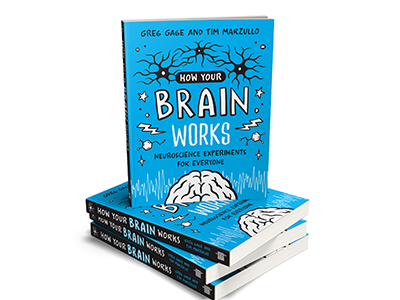
Don't forget to check out our book, How the Brain Works, a detailed guide organized to lead readers effortlessly through our experiments, enhancing your understanding and making neuroscience accessible and enjoyable.
Categories
Devices
Human Physiology
Invertebrate Physiology
- Neuron SpikerBox
- Neuron SpikerBox Classic
- SpikeStation (Pre-release)
Plant Physiology
Neuroengineering
Software
- SpikeRecorder (All Platforms)
- iOS
- Android
- Desktop (Windows, Mac, Linux)
- Web (In Development)
- Troubleshooting
Policies
Troubleshooting
If you're experiencing issues with device connectivity, noisy recordings, or software errors, please consult our dedicated troubleshooting resources:
- SpikeRecorder Troubleshooting Guide
- Device-specific troubleshooting is available within each device's page under the Experiments or Troubleshooting sections.
Support
Encounter an issue? Check out our Troubleshooting Guide or contact us at:
- Email: hello@backyardbrains.com
- Phone: +1 (855) GET-SPIKES (855-438-7745)
- Hours: Monday - Friday, 9am - 5pm EST
We hope you find this documentation helpful in your scientific explorations and educational efforts.