Style Guide
Overview
Backyard Brains is on a mission: to make neuroscience more accessible for everyone. We make tools for the home and classroom to help everyone understand more about how the brain works. By using simple DIY tools, hands-on learning, easy to understand language and comic illustrations we make science fun for new audiences.
These brand guidelines highlight our playful personality while setting standards for clear and effective communication.
Personality and Voice
Our voice should make neuroscience feel inviting without making it feel trivial. These three principles guide how we write, teach, and design.
Smart and funny
Make serious science enjoyable.
Use humor to open the door to complex ideas. We are willing to look a little silly when it helps people engage, but the science stays accurate.
Original
Create, don't imitate.
We make our own content and lead with curiosity. Favor handmade illustrations, distinctive typography, open-source thinking, and the practical character of DIY science.
Accessible
Invite everyone in.
Move learning beyond the lab. Write for curious people of all ages in clear, welcoming language—simple enough to understand, never dumbed down.
What we avoid
Keep the voice curious, generous, and human. Avoid:
- Ivory-tower language or pedantry
- Top-down instruction or passive participation
- Homogeneity or bro culture
- Generic stock imagery or mass-produced polish
Our Logo
Mark Development
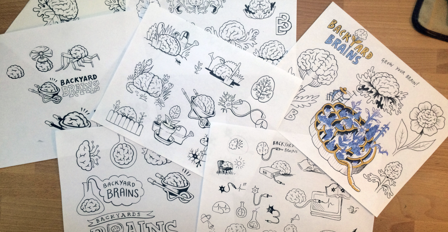
Our mark is the product of months of work with an artist and designer to capture and refine the unique identity of Backyard Brains.
Logo Usage
The Backyard Brains logo consists of hand-drawn type and illustration. It has a playful, humorous character that expresses science + fun.
The full color version is the primary style to apply for white or branded color backgrounds. Depending on the format both horizontal and stacked versions are supplied.
Download Images
| Format / Size | Horizontal | Stacked / Vertical |
|---|---|---|
| Vector (SVG) | Download | Download |
| Vector (PDF) | Download | Download |
| Small (150px PNG) | Download | Download |
| Medium (512px PNG) | Download | Download |
| Large (1024px PNG) | Download | Download |
| Extra Large (3000px PNG) | Download | Download |
Monochrome Logo
The monotone version can be applied in instances where the logo needs to be a single color or material - such as a stamp or knocked out from a dark background.
Download Images
| Color Version | Horizontal | Stacked / Vertical | Icon |
|---|---|---|---|
| Black for light backgrounds | SVG · PDF | SVG · PDF | SVG · PDF |
| White on approved dark background | SVG · PDF | SVG · PDF | SVG · PDF |
All Variants
Download all color and monochrome logo variants (9-page vector PDF)
Download the monochrome comparison demo (SVG)
Icon Only
The neuron icon can be used independently when space is limited or for social media avatars, favicons, and other compact applications.
Download Images
| Format / Size | Icon |
|---|---|
| Vector (SVG) | Download |
| Vector (PDF) | Download |
| Small (150px PNG) | Download |
| Medium (512px PNG) | Download |
| Large (1024px PNG) | Download |
| Extra Large (3000px PNG) | Download |
Clear Space and Minimum Size
The logo needs room to remain recognizable. Keep other text, images, and page edges outside the clear-space area.
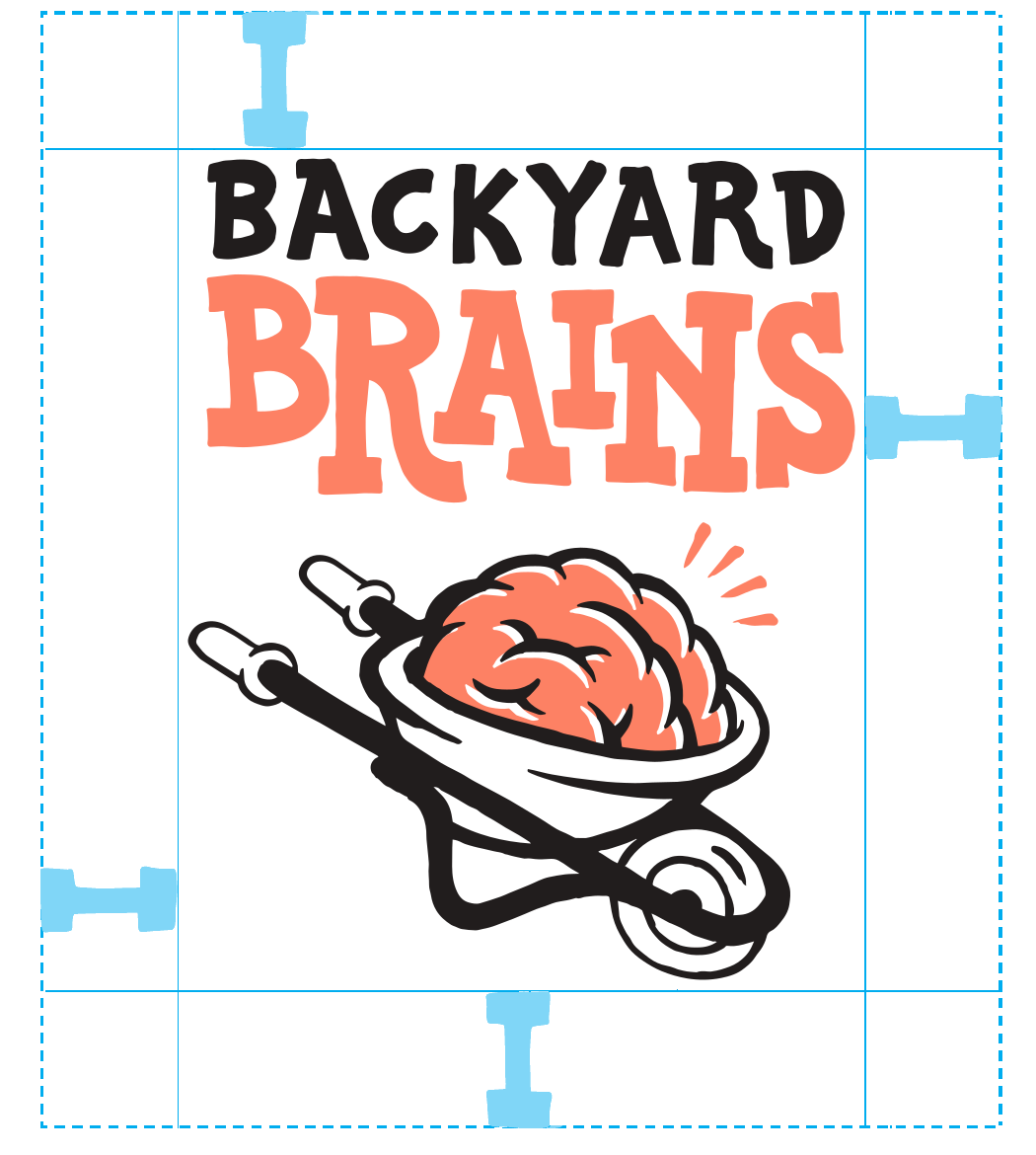
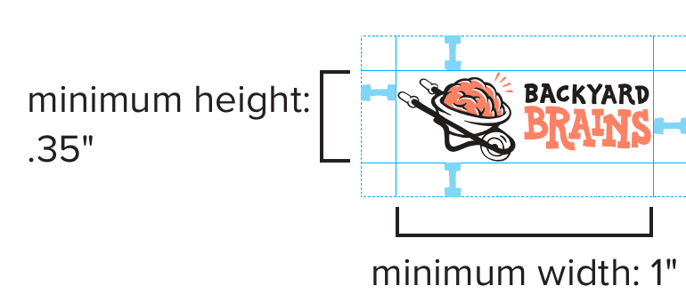
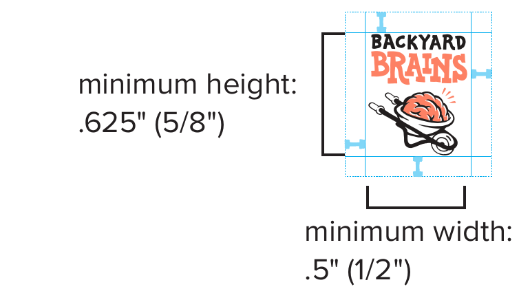
For digital work, choose the horizontal or stacked version only when every letter remains legible. Use the icon at smaller sizes.
Logo Use and Misuse
Use
- Full-color logos on uncluttered white or light backgrounds
- White monochrome logos on the approved dark background
- Original proportions, spacing, type, and arrangement
- Only the approved color and monochrome files supplied here
Avoid
- Busy photographs, patterns, or backgrounds with poor contrast
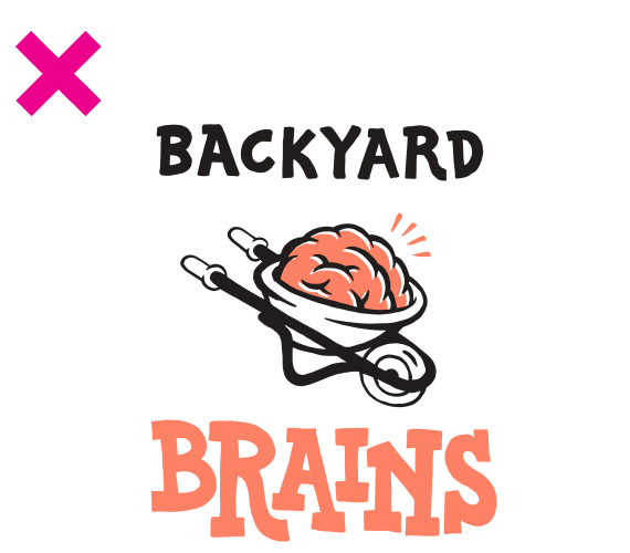
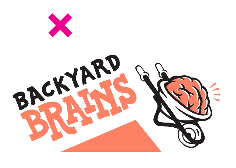
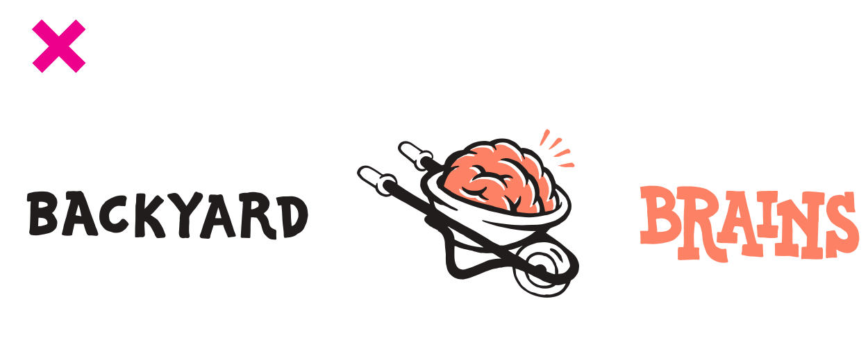
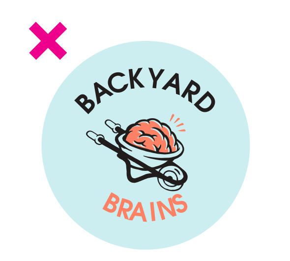
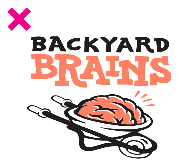
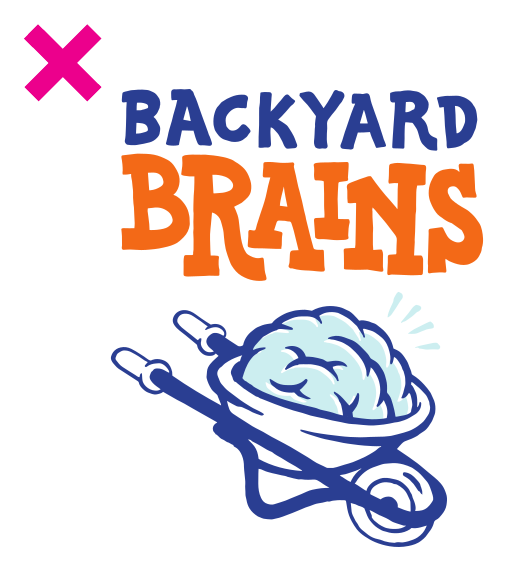
- Stretching, rotating, rearranging, adding, or removing elements
- Recreating the lettering or setting the name on one line
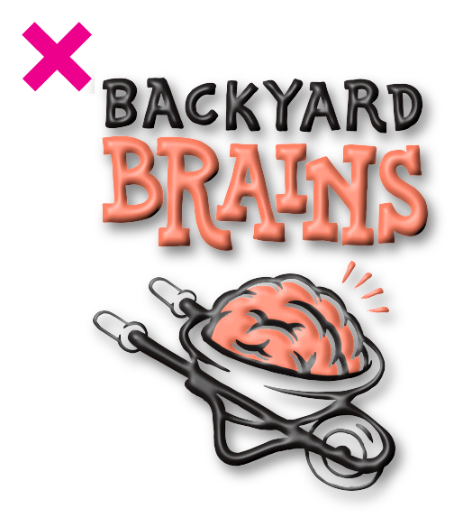
- Drop shadows, blurs, outlines, gradients, or unapproved colors
Examples of What Not to Do
These examples show the current logo used incorrectly.
Brand Colors
Our color palette is carefully chosen to represent different product categories while maintaining brand consistency.
Primary Colors
| Color Name | Hex Code | Product Category | Usage |
|---|---|---|---|
| White | #FFFFFF | All | Backgrounds, illustrations |
| Black | #000000 | All | Text, illustrations |
| Ambiguous Orange | #FD8164 | All | Accent, color pops, Neuroscience callouts |
| Neurogenta | #D01BA4 | Neuron | Accent, color pops for Neuron product line/educational content |
| Simpsonish Yellow | #FEC52E | Human | Accent, color pops for Human product line/educational content |
| Golgi Green | #18A953 | Plant | Accent, color pops for Plant product line/educational content |
| Broca Blue | #1996FC | Neural Engineering | Accents for engineering/coding products/educational content |
Support Colors
| Color Name | Hex Code | Product Category | Usage |
|---|---|---|---|
| Tinted Support Orange 1 | #FFCDBE | All | Used to support the main brand color when multiple tints are needed |
Typography
Typography should be clear first and characterful second. The hand-drawn voice is most effective when it contrasts with simple, highly legible supporting type.
Roboto
Use for body copy, navigation, documentation, captions, and interface text. Prefer sentence case for prose and title case for headings and menus.
Hand-drawn lettering
Use for short product names, campaign titles, and expressive moments. All caps belongs here—not in navigation or long passages.
Hand-lettered notes
Use concise hand-lettered captions, labels, and speech bubbles. Keep paragraphs and detailed explanations in the surrounding body text.
Custom Lettering Principles
- Draw imperfect, human lines rather than digitally perfect geometry
- Favor bold, blocky letterforms with custom ligatures or nested letters
- Avoid outlines, rendered shading, and decorative effects
- Keep display lettering short; never use it for multi-paragraph text
Layout and Composition
Build a clear hierarchy, use the current brand colors for purposeful accents, and leave generous white space around important content.
Show, don't tell
Lead with an image, experiment, or result. Keep supporting text concise.
Let elements breathe
Use open, uncluttered layouts with enough space to make the hierarchy obvious.
Keep it in the family
Make related materials feel like one system through consistent type, spacing, illustration, and color.
Illustration Style
Our illustration style has a hand-drawn, sketch-like quality that blends scientific accuracy with a playful, surreal aesthetic. It maintains a balance between informative and expressive, making complex concepts more accessible and engaging.
We hire multiple illustrators who work within a shared visual language. Here are examples from two contributors:
| Cristina Mezuk | Matteo Farinella |
|---|---|
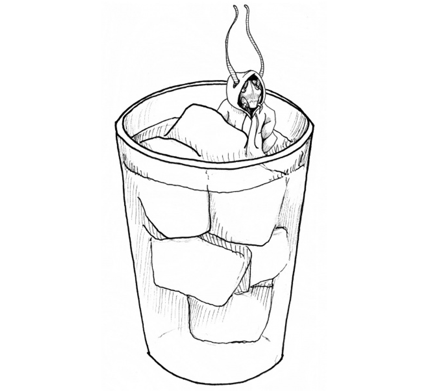 | 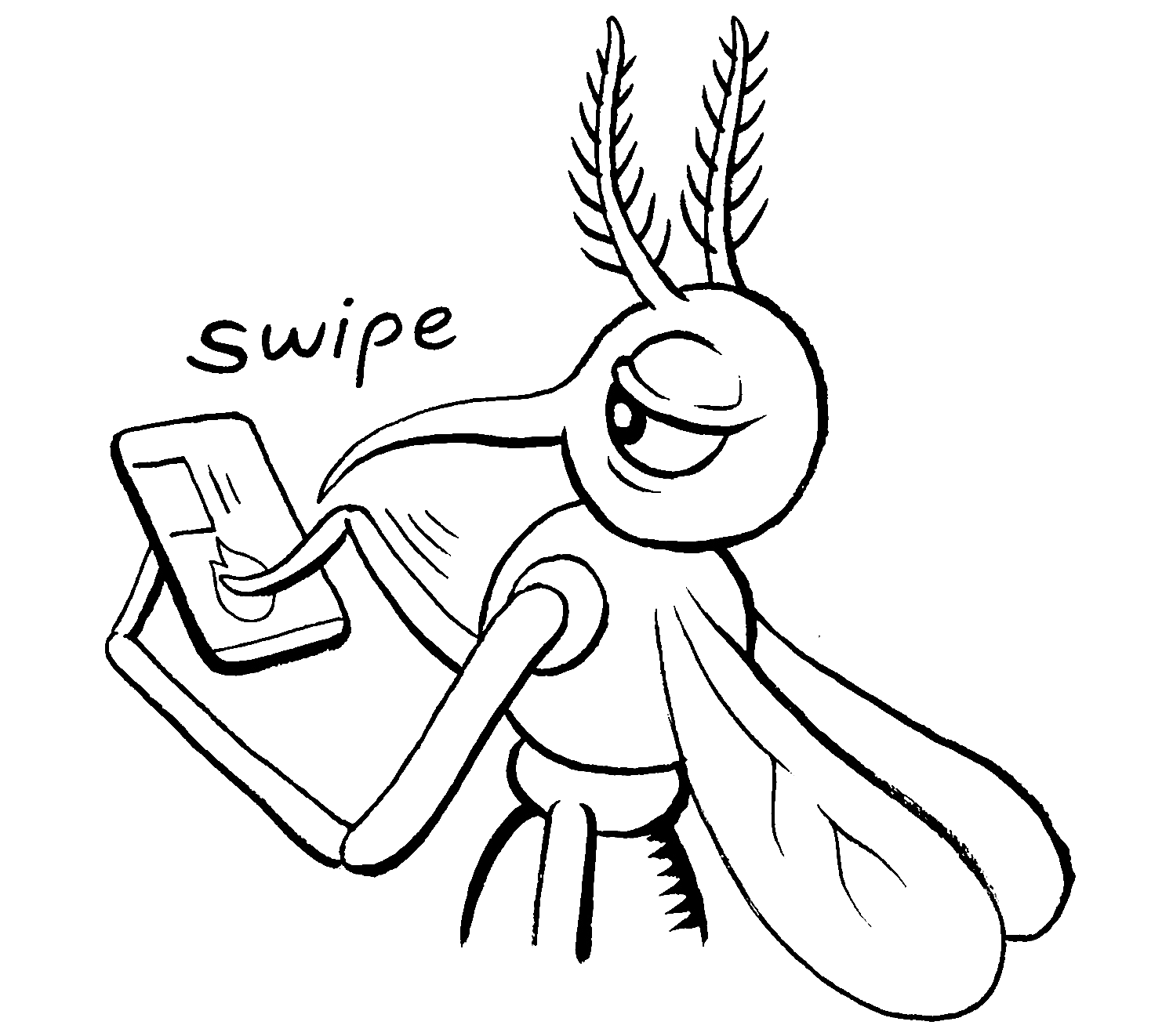 |
While each illustrator has their own unique style, they all follow the same guidelines.
Look & Feel
- Minimalist & High-Contrast: The illustrations primarily use black linework on a white background, with minimal color accents. They rely on bold, clean strokes without excessive detail, ensuring clarity even in intricate concepts.
- Hand-Drawn & Organic: The linework feels intentional but loose, avoiding rigid precision. It has an intuitive, scientific notebook-meets-comic book quality.
- Hatching, No Fills: Never use solid fills in illustrations. Use hatched lines to indicate shading.
- Conceptually Driven: Many illustrations communicate abstract ideas visually, using metaphors, simplified forms, and symbolic elements rather than hyper-literal depictions.
- Slightly Surreal & Playful: While rooted in science, the illustrations introduce unexpected, often humorous twists—like insects using human technology or neural processes represented as physical interactions.
- Dynamic & Expressive: Subjects often have exaggerated gestures, directional lines, and movement cues, making even static images feel lively.
- Scientific Meets Whimsical: Whether it's a neuron with personality or an insect engaged in human-like behavior, the style maintains a balance between technical insight and creative storytelling.
Common Motifs
- Anthropomorphized Insects & Creatures: Insects and animals often take on human-like traits or interact with technology, reinforcing neuroscience themes in a relatable, engaging way.
- Hand-Written Text: Never use computer-generated text in illustrations.
- Schematic & Geometric Elements: Some illustrations incorporate scientific diagram-like features without becoming rigid technical drawings.
Illustration Guardrails
Use
- Humorous metaphors and expressive, anthropomorphized characters
- Sketchy hand-drawn lines with simple, memorable forms
- Clear experiment diagrams with minimal captioning
- Primarily black-and-white line art with restrained current-color accents
Avoid
- Highly rendered textbook realism
- Complex scenes, extraneous details, heavy shading, or solid fills
- Long labels that should live in the accompanying text
- Generic stock art or digitally perfect linework without character